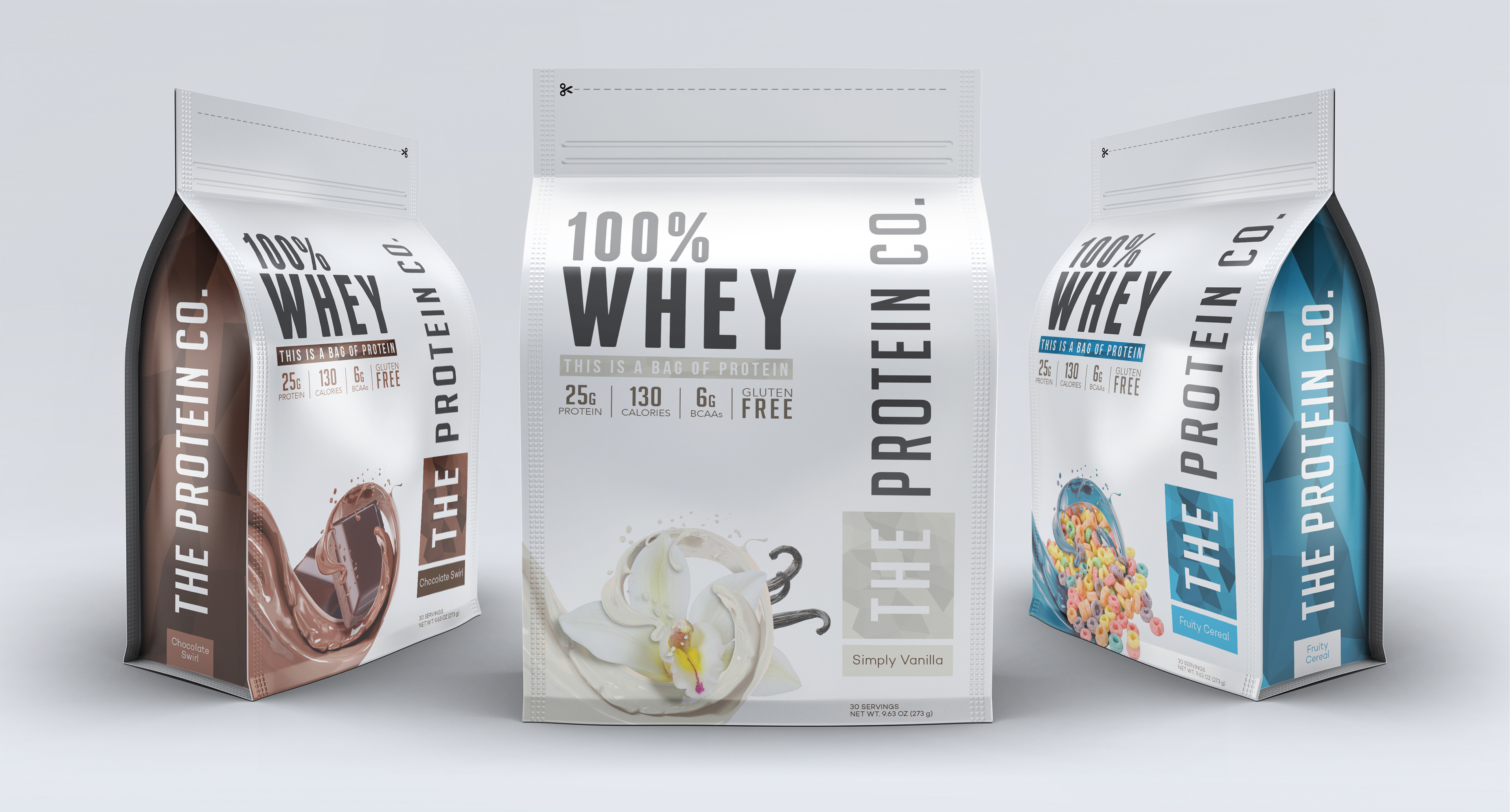
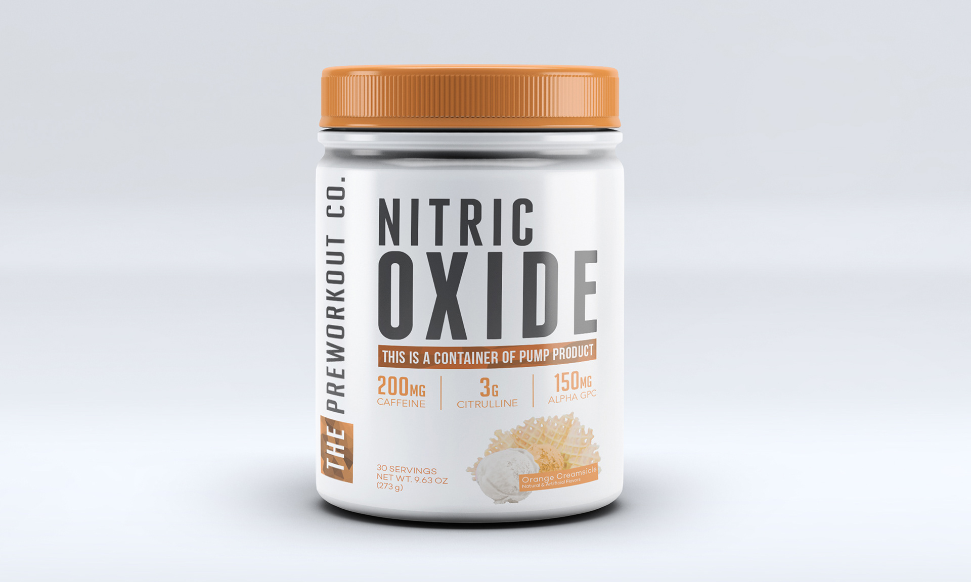
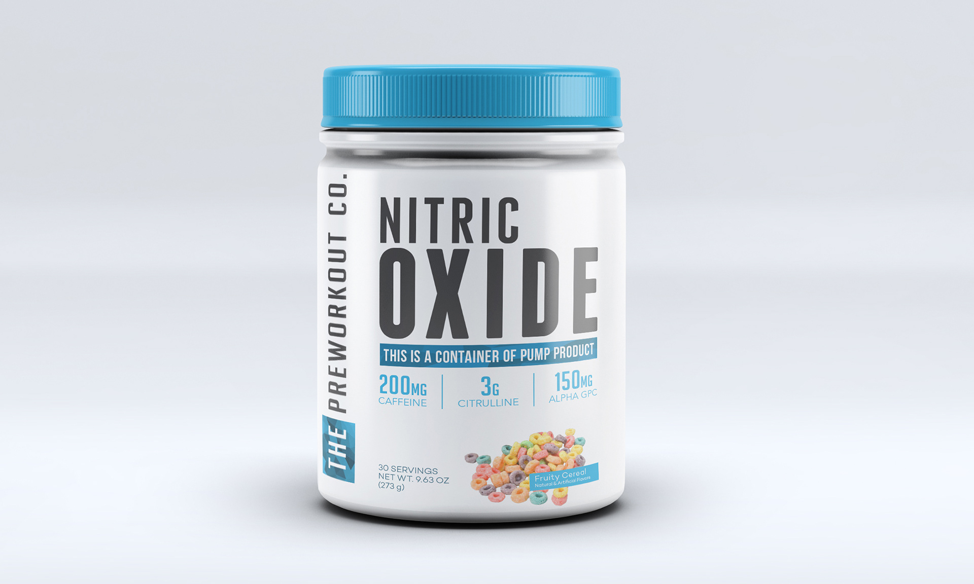
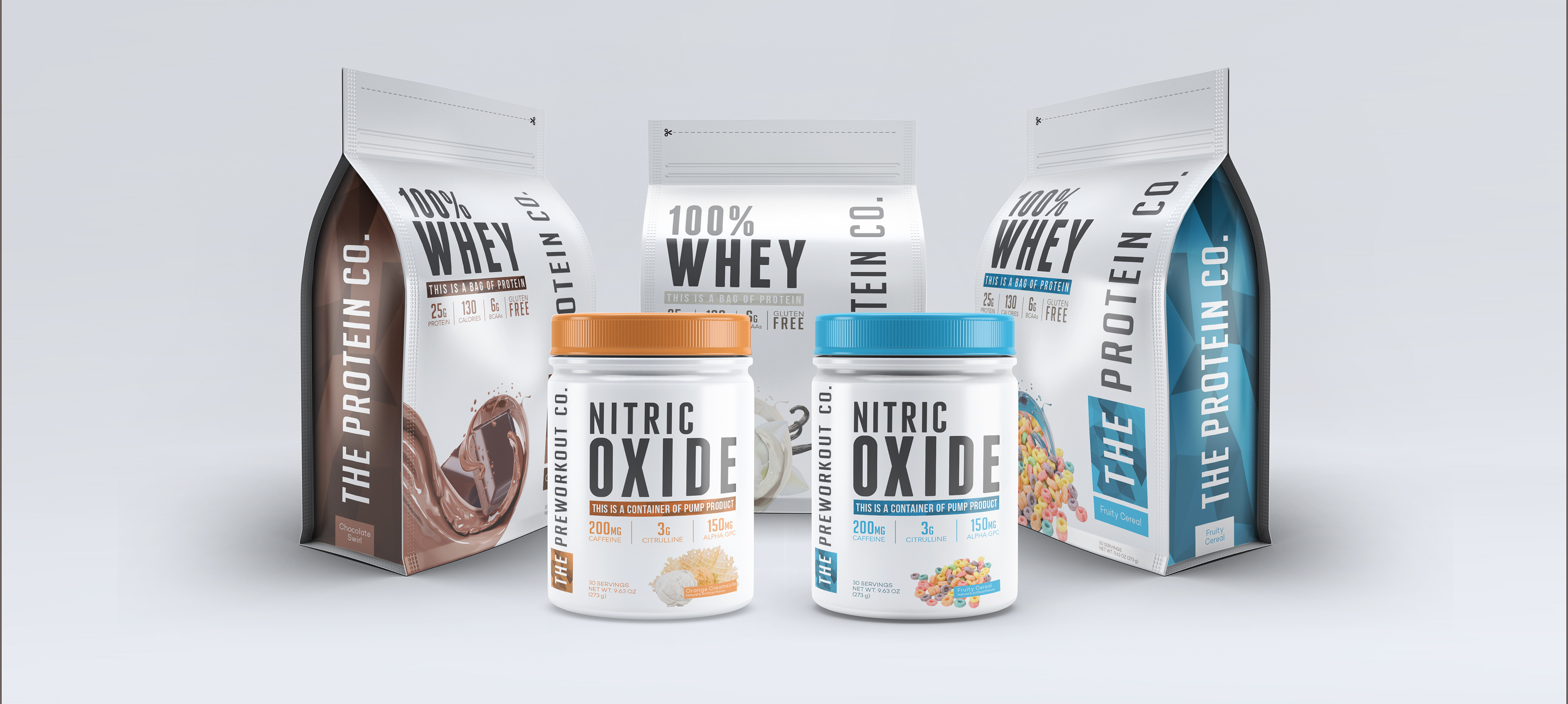
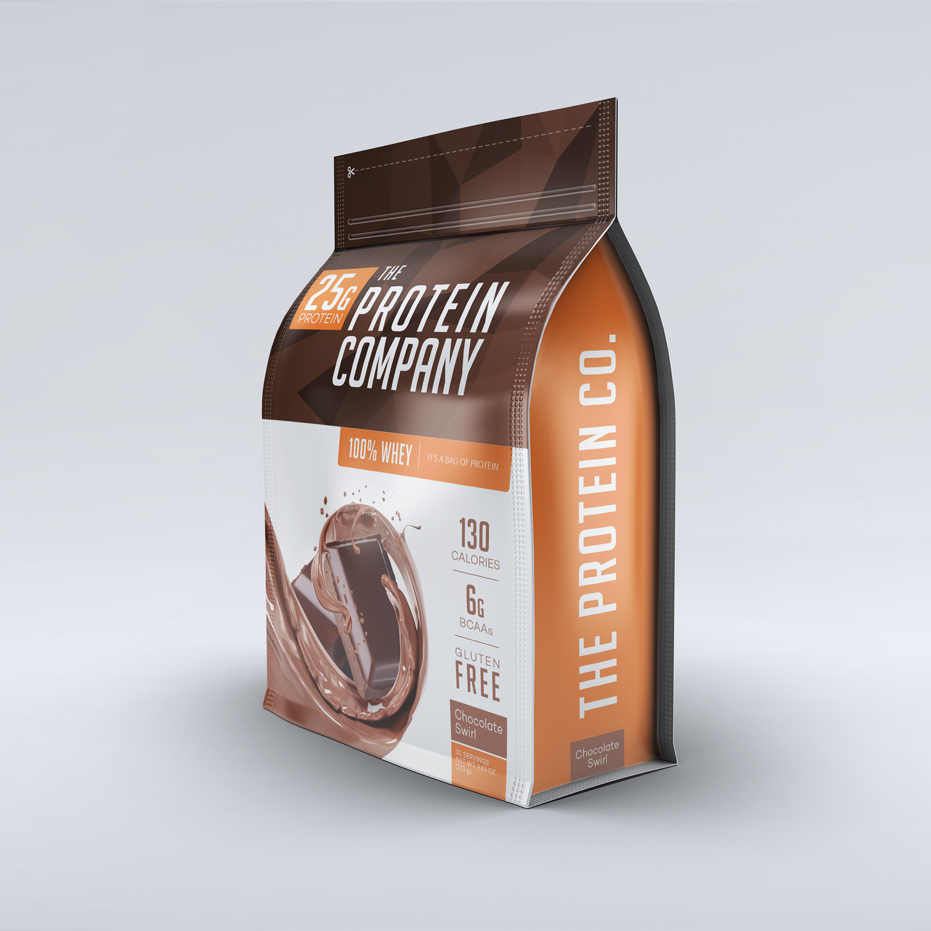
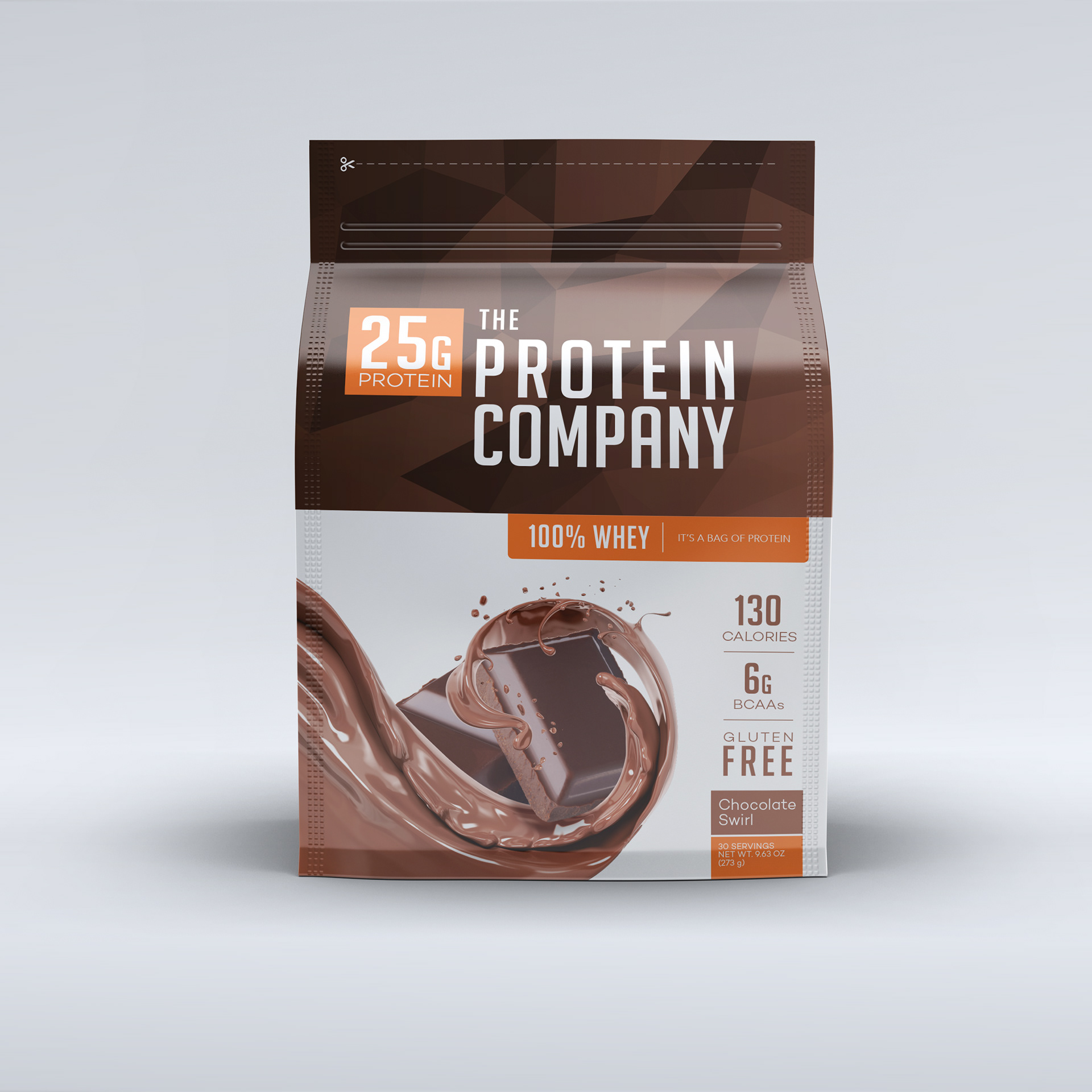
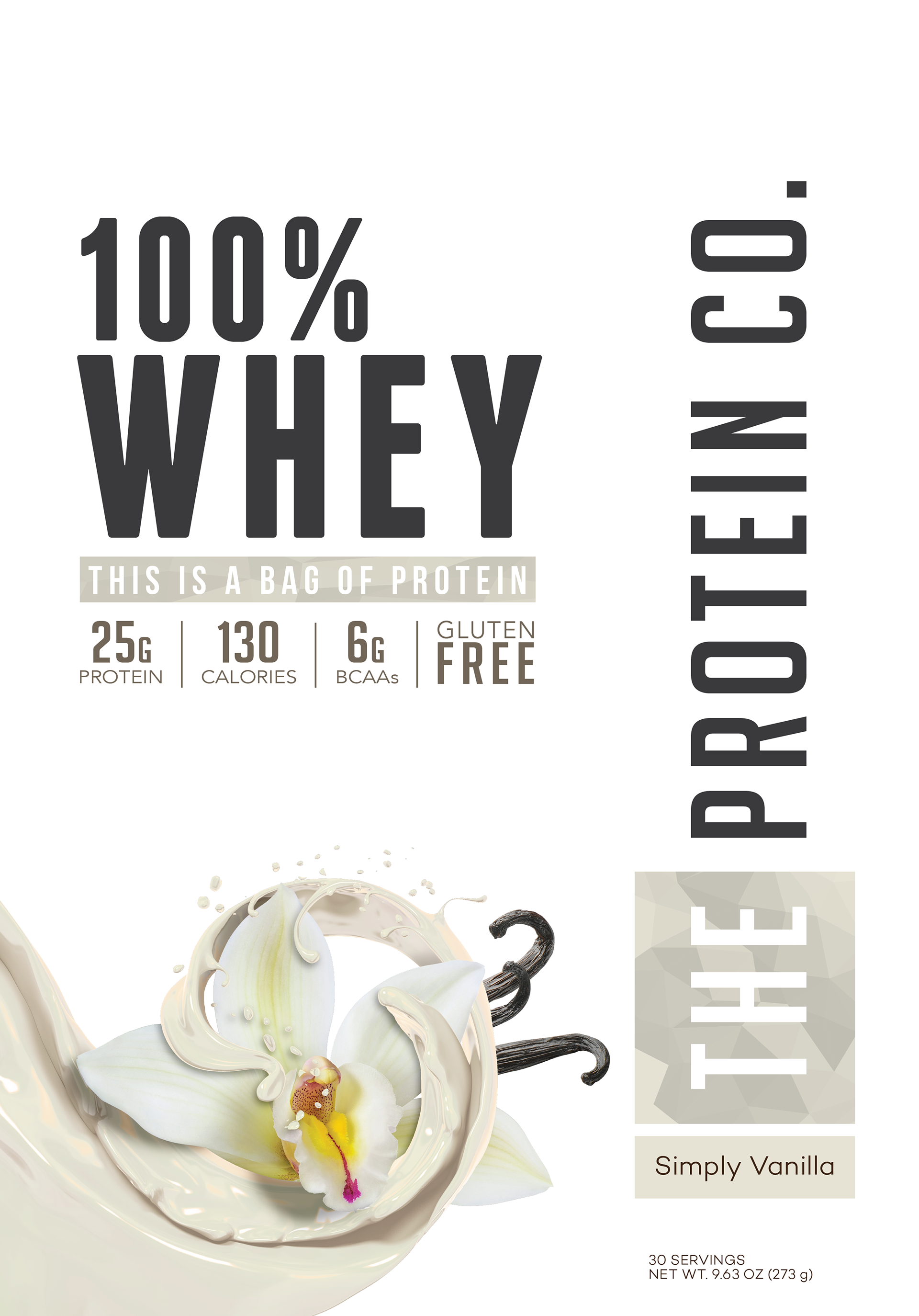
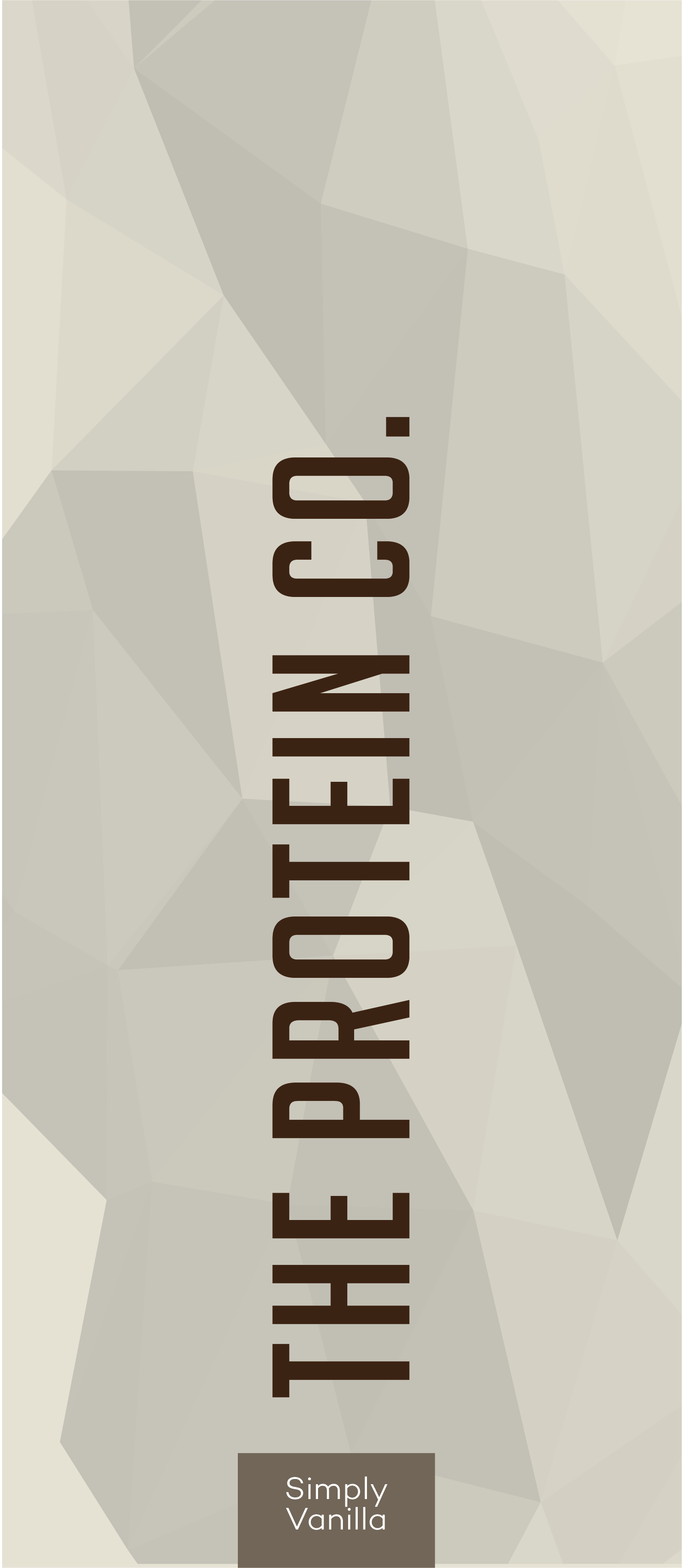
Looking to target a new audience, my client was launching a new line with a completely redesigned look and feel. My design features clean fonts, tight lines, and an ownable element (stained glass) that will be carried across the line of releases to help tie the products together when on a shelf or screen.
• Creative Direction
• Design Execution
• 3D Render
• Design Execution
• 3D Render
— Initial Concepts —
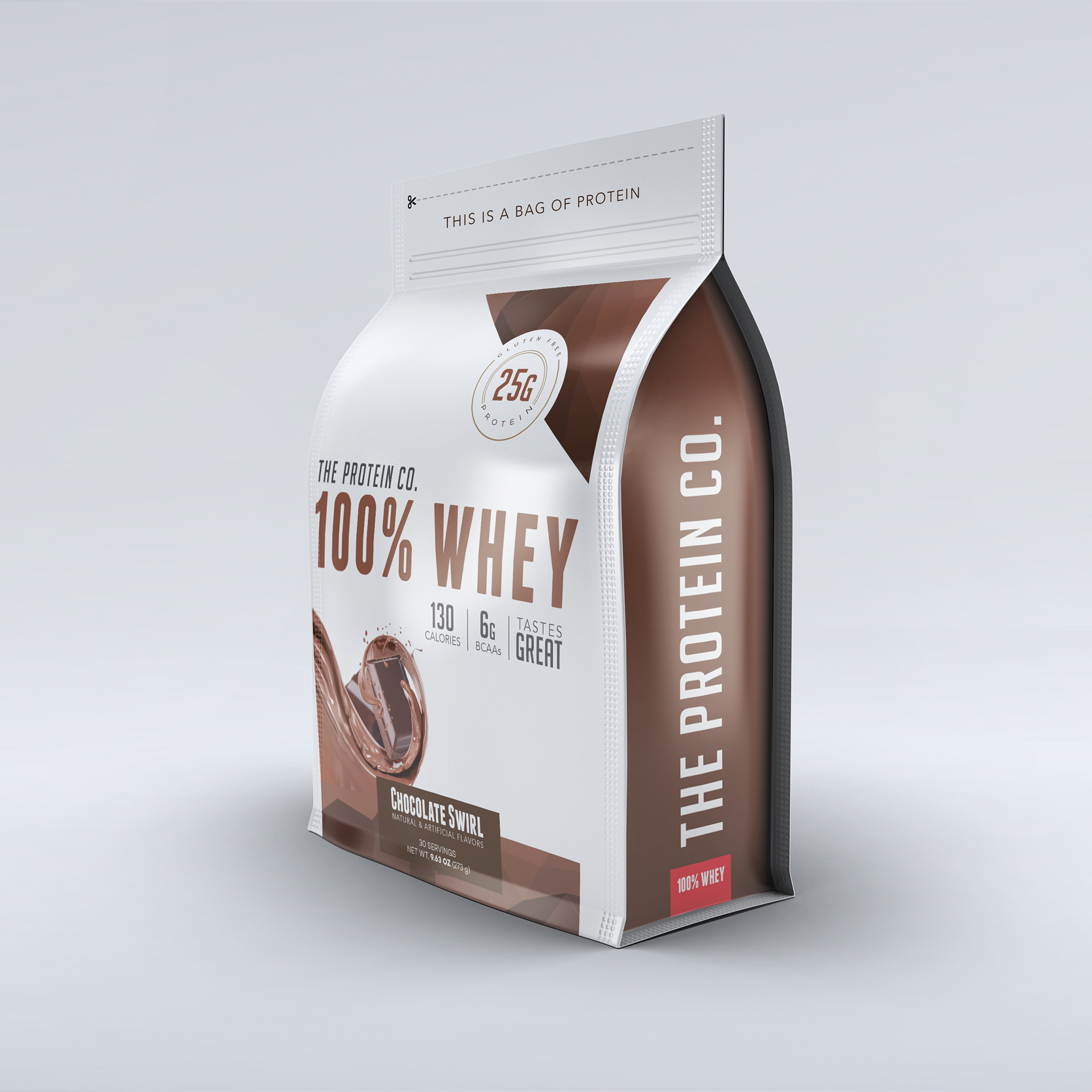
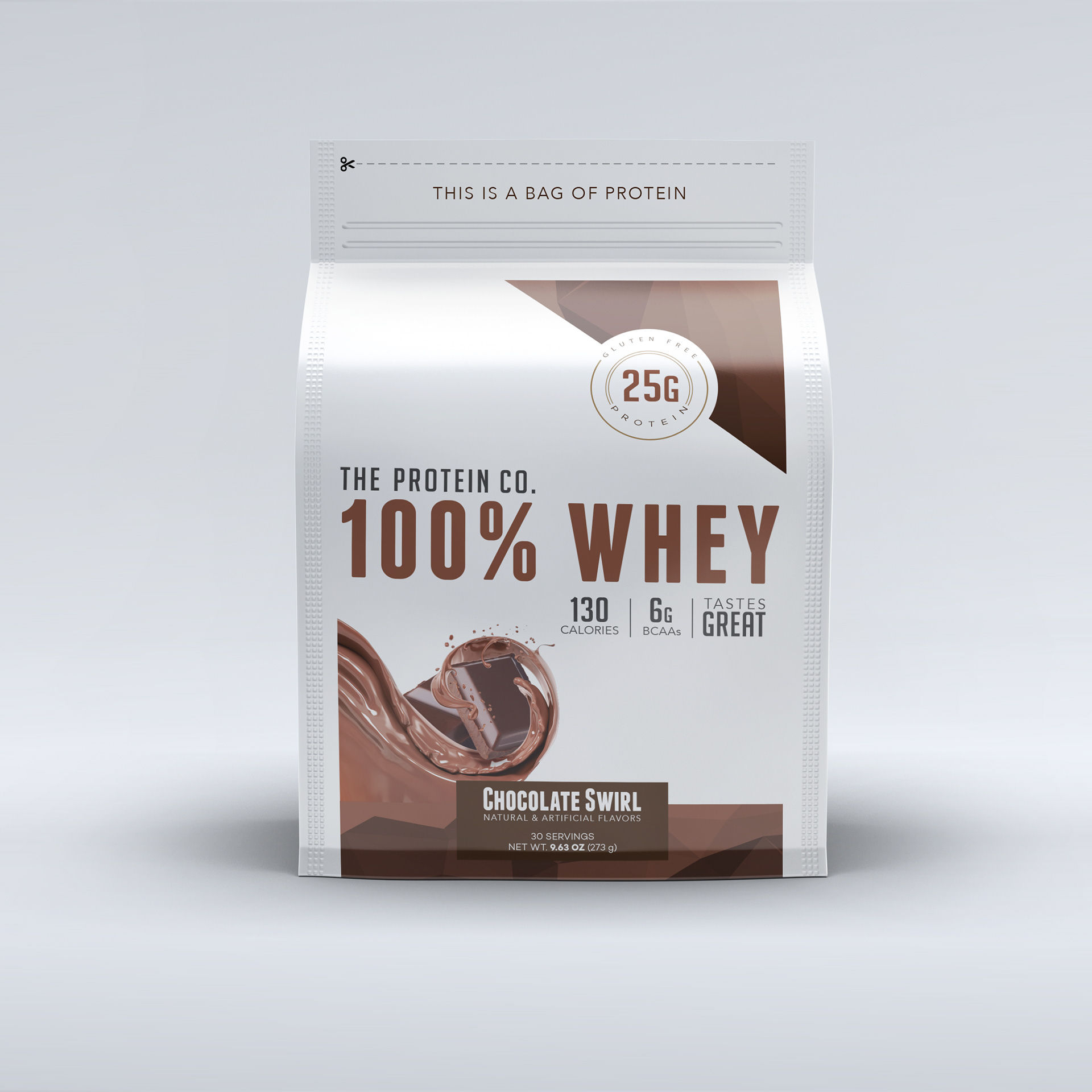
The client chose to combine a few elements from each design to create the final package. Moving forward with a cleaner front panel, The layout was adjusted to create a better textual hierarchy, and the stained glass was used in a more prominent manner.
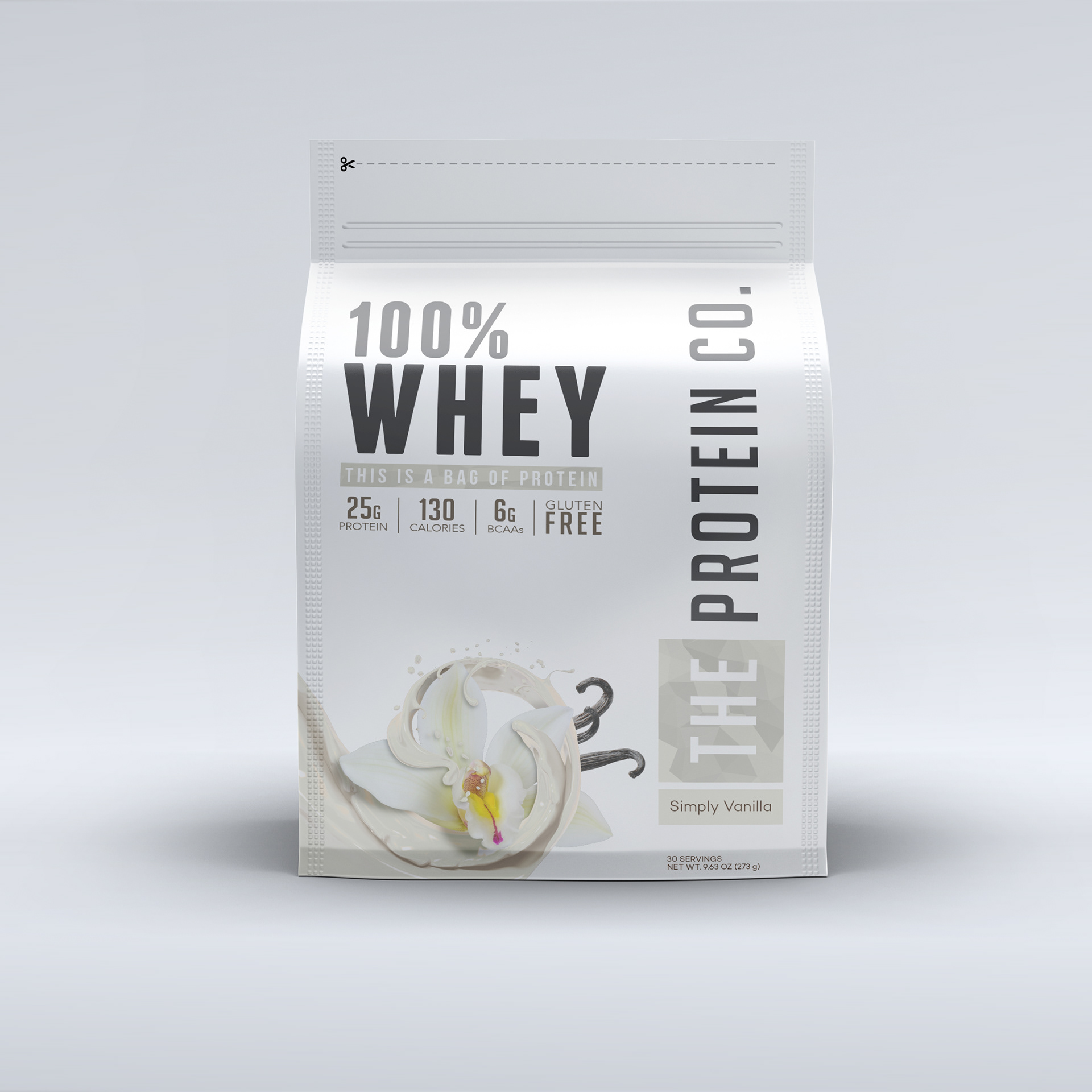
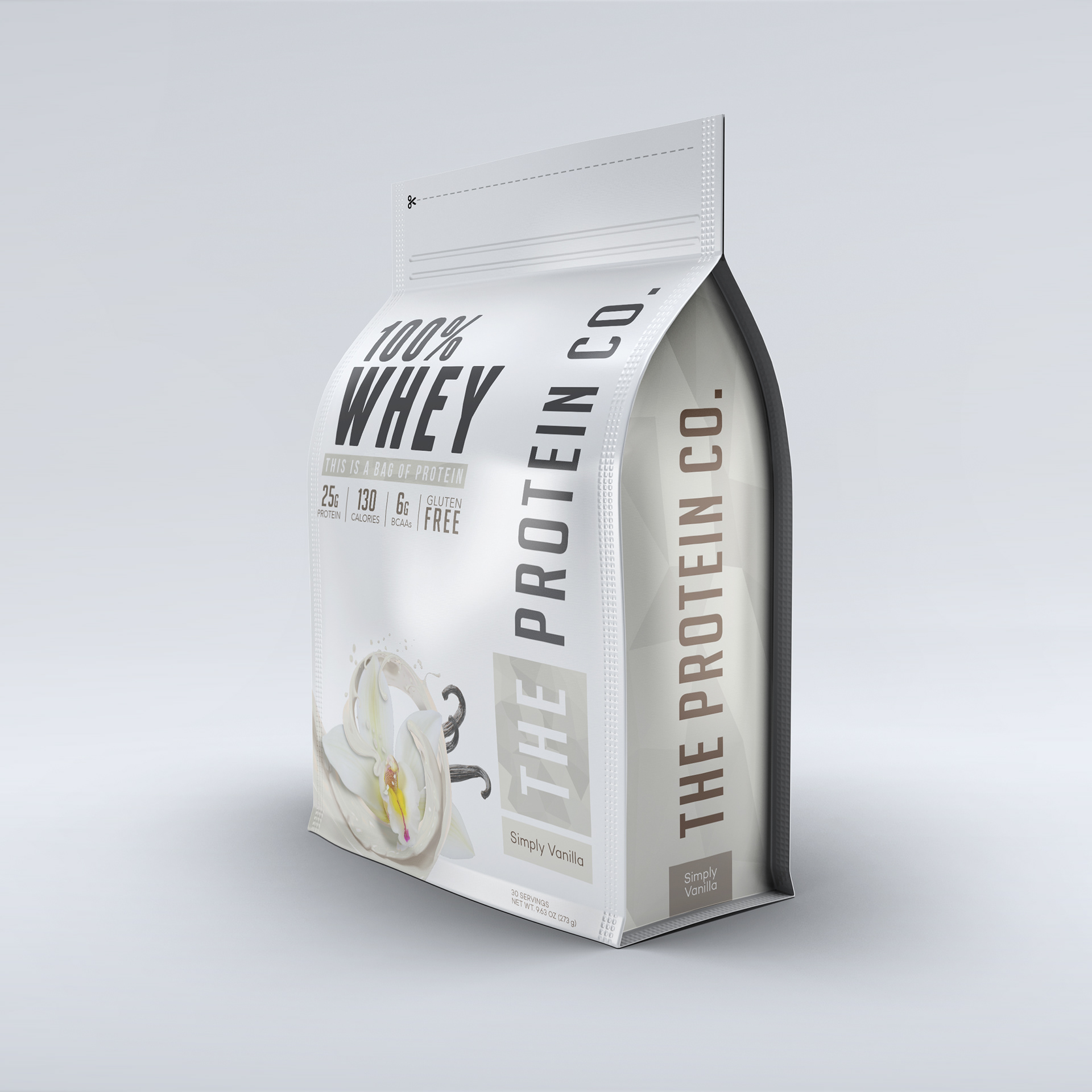
Multiple flavor profiles were built showcasing how each would look across the line.